
2017
In November our inspiration comes to you from Poncho Army with Landing.

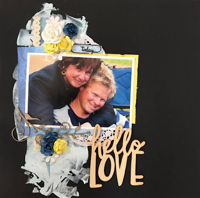
CRITERIA - Use a BLACK background
MARIA
 My challenge is quite simple. Black background, bright strips and cute photo.

JUDY
 The striking colours of the bird on the black background in the artwork are stunning and have inspired my colour choice and the photo. I took the photo recently when the cheeky cockatoo "joined us for lunch"!

TRACEY
 I loved this new sugar skull piece from Memory Maze chipboard and couldn't wait to use it. The black background criteria for this months challenge was perfect. I even found an old set of basic grey chipboard that I used to embellish this. Love when I use up old stash with new stash.

ELAINE
 I chose to use the blue and yellow of the painting in my layout. My background is made with gesso coloured with mist.

TANYA
 I loved the pop of yellow in this painting too.

EVELYN


CRITERIA - Celebrate friendship theme
JUDY
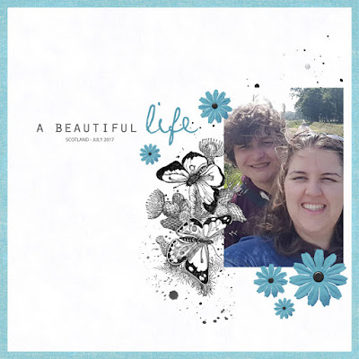
 I was immediately inspired by the simple theme of the painting - friends looking out to sea and have used a photo of myself and a longtime friend taken several years ago. I have used soft shades and flowers too.

ANNA
 I was inspired by the flowery bath suites and summertime feeling. I celebrate the friendship between our youngest kids. Pics from our Swedish Midsummer celebration.
KAREN


KAREN

Here is a great photo of my son and four mates who now at 19 are all still good friends.
TANYA
Here is my daughter and new friend she made while on a recent Contiki holiday.
TRACEY
 I have used the new Cocoa Vanilla Bohemian Dreams papers and accents for this friend inspired layout.

ELAINE

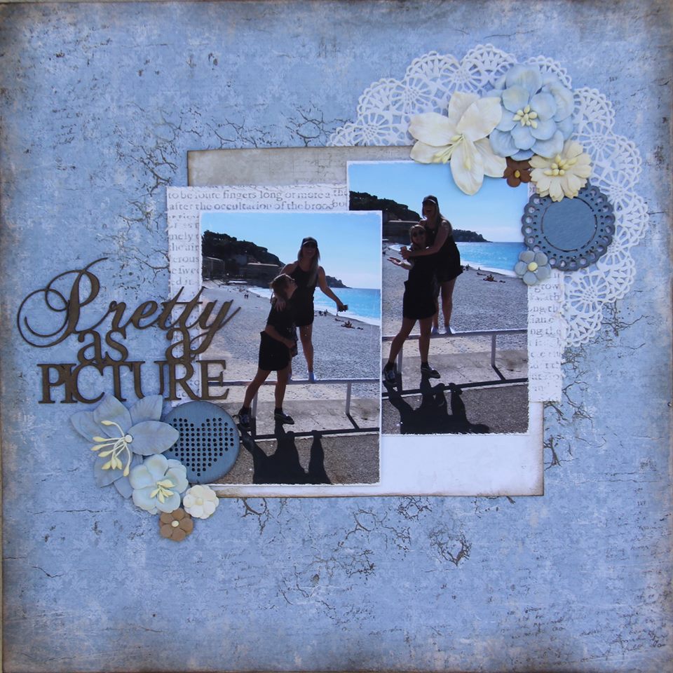
A photo of my friend's son, with my daughter. Their friendship has grown up along with them. It's been so beautiful to see. I used the summer colours from the painting as part of my inspiration.
 I was inspired by the horizontal design and the beachy feel, as well as the sand and sea colour scheme.

ANGELIKA

KAT
 I was inspired by the three friends and the pastel colours of the painting. I imagine that these three cuties will be great friends as they get older.

TONE
 I was basically inspired by the theme "friends", but also "hats" generally,

KRIPA
 I used a picture of my kids to document the day their friendship began. Pastel shades were inspired from the painting.
MARIA
 In the photo my friends. We have been friends for many years. We often spend time together. And it's very inspiring! Headline - "Our life"

MARIA

EVELYN
 The photo shows my 18 year old daughter and one of her girlfriends. And what is the most wanted thing to do - making party! I was inspired by the patterned swim suits from the picture.

JANE

I was drawn to the pastel colours of the painting and my desire to celebrate the special sibling friendship between my children which started with his arrival and continues strongly to this day.

CRITERIA - Use paint on your work
TANYA
 I thought I should scrapbook this recent photo of my daughter. This photo was taken on the Monaco Coast. I have used water paint on my layout.

HELENE


I have used acrylic paint at the background to give an illusion of brush marks.
TRACEY

ELAINE
 I have gone with the beach theme. For my background, I used water paint which I first painted on clear acetate and then rubbed on to my page. I have also used texture paint with a cross stencil and lastly misted some yellow on top.

JUDY

EVELYN
 Oh, what a wonderful summer scene! I wanted to make a summery project too and made these art journal pages in my "faces" journal. I used acrylic paint in the colors of the reference picture. I´ll show you some ways to use acrylic paint at the 8th, so come back to see more!

MARIA

In August we feature Joshua Miels with Illustrations.

CRITERIA - Black and White PLUS One (any colour)
EVELYN
 I was inspired by the scribbly painting, I wanted to copy it a little bit with some stamping.

TANYA

MARIA

I made ATCs about my city. I was inspired by the color of the picture and the abstraction.
HELENE
 I used black and white with gold/sand. Those colors are perfect to make a summer feeling.

ELAINE

This painting reminded me of this photo, so I knew I had to use it. And I couldn't go past using teal with black and white. I mixed mist in with gesso to help create my background. Lots of little elements to surround the photo as the faces are surrounded in the painting.
JUDY

I have used green, black and white and was inspired by the blended effects in the painting.
TRACEY

From the moment I saw this art inspiration I wanted to try a photo transfer so I could in bed it in the background paint effects. I had the photo copied onto ordinary paper with a laser copier. It must be toner ink not cartridge ink for it to work. I then covered the front of the image with heavy gel medium and stuck it face down onto the layout. Wait for it to totally dry, then wet the paper and rub off. I have used acrylic paint, inks and house paint on the back ground with some stamps both in Ink and Paint.


KAT

I was inspired by the faces to make a pocket page about my children.
KAREN
KAREN

My inspiration came from the face within the painting.
TONE
 The title is: Big catch. The photo is of my son with his big catch of fish, the first time he is fishing

KRIPA
 I imagined the girl in the painting talking to herself and decided to make an art journal page with a message for myself - 'I am Enough'

ANNA

I was inspired of the design and as you see I went for the turquoise + b&w colors.
JANE

As you can see I loved the use of blue with the black and white.
In July we bring you a work from Robert Klippel called Abstract.


CRITERIA - Use PEN on your work
HELENE
 The pattern in the painting made me think of squares and I used a black pen to draw a grid pattern as a background.

ANNA

I was inspired by the colors and of course the use of pen . I wrote lines around some of my paper squares and I wrote the journaling with a pen. And the photo is a documentary of how my sweet daughter used some color pens on her hands to cheer on our bandy- team when they played the final of the Swedish Championships this past winter.
MARIA

I used the pen for circles and doodling. Arrows are stamps and drawings. And I was inspired by the chaos in the picture .
ELAINE

I have used pen to create my background of stripes. I then added watercolour picking up the orange in the painting. I used more of the colours in the papers.
I have used pen to create my background of stripes. I then added watercolour picking up the orange in the painting. I used more of the colours in the papers.
TRACEY
 I used a template and some distress inks. Used a black pen around all the shapes to create a stained glass effect.

TANYA

JUDY
 I was inspired by the pastel shades in the artwork and by the repetitive nature of the brush strokes.


 I was inspired by the straight lines and the geometric mood of the picture. I used a photo from the 18th birthday of my daughter she celebrated at the end of June. Her biggest surprise was to get her own little car! She was so happy! I used a square stencil and surrounded some of the squares with a red pen and did some doodling in there too.


from our second team ...
KAREN

Lots of pen work and I have done a little tutorial for you all on my BLOG.
KAT

For this challenge I made a card featuring some fun patterned paper that matches the combination of watercolours and pen lines and multiple direction in the artwork. I added extra pen work to the handmade rosette, the envelope and on the inside of the card.
TONE
 I have used a pen around every paper and round the stars. At this age Daniel used an eyepad ... that's why his eye does not show.

ANGELIKA
 I was inspired by the look of colour on black lines so I used that technique to make the teacups by watercolouring over pen. I also liked the combination of golden yellow, pink and blue/green, so I made sure to use those colours.

EVELYN

KRIPA

I've used the colours in the painting and for the pen work, outlined the pattern paper and the title with black pen. I'm very inspired by the stunning CAS layouts that Anna Uhras makes and tried to make a CAS layout. Quite obviously, I miserably failed CAS and reverted back to my usual minus extreme messy! I also have a video tutorial up on my BLOG.
JANE

To me it was all about using the colours from the painting to create my page. I then used black pen to outline the base paper and all the individual pieces and also used a stencil to add some extra embellishment to my page.
In June we feature Ethel Spowers with The Kite.

CRITERIA - VINTAGE style OR featuring CHILDREN
(or for an extra challenge combine both)
JUDY

I was inspired by the vintage feel of the painting and the children depicted and scrapped an 8 x 10 layout of my brother taken in the early 50's.
EVELYN

For this challenge I decided to alter a little stand, I found in a dollar store. I painted it, using some green like in the artwork and added a vintage photo of a little girl.
MARIA

In the photo, my brothers in childhood! It's so cute - now they are very grown-up. My inspiration is the colors in the picture.
ELAINE


I loved the neutral colours in this painting and picked it up for my layout, with a few bits of colour. And I just had to add a kite.
HELENE

TANYA

Of course to create a vintage feel I thought it best to use a photo of my mum and aunty as children. I loved the green and cream tones in the painting too.
TRACEY

Vintage child is my mother as a flower girl. Used the new Heidi Swapp Magnolia Jane papers.


KAT
Huge congratulations to Kat from all of the team on the birth of twins ...
 I find vintage style challenging so I made a layout about my children. I don't have much time to scrap with newborn twins so I used a pre-made page kit which features geometric shapes (inspired by the kite) and some of the colours from the painting.

Huge congratulations to Kat from all of the team on the birth of twins ...

TONE

I decided to feature children (well one child) outdoors playing.
ANGELIKA
 I was inspired by the sepia tones in the painting to do my photos in sepia. The vintage challenge inspired me to do a page about a flapper girl performance. I also fussy cut a million vintage roses.

KAREN

The inspiration I have taken from this painting is the sense of oldy worldy.
KRIPA

I started with vintage & children and ended up making shabby chic instead the painting of the children looking at the kite inspired me to pick this photo of my son.

I started with vintage & children and ended up making shabby chic instead
ANNA

I have made a try to combine both but I'm not sure how I succeeded  - the wooden background has that vintage feel and I am featuring children or at least one child. I have used some of the colors from the painting too.
JANE

I've combined both taking the colours from the painting as my inspiration. I've used a sweet photo of a family member.
In May we feature New Zealand artist Michael Sass with The Garden.

CRITERIA - FLOWERS
TANYA

I loved all the flowers in the painting so tried to use as many as I could on my layout. Seeing that it was a Mothers Day Tribute I have used a photo of my daughter who will miss her first mothers day with me as she is heading to Europe the week before!
EVELYN
 For my layout I used a very romantic picture and I used the queen of flowers on it - the rose!

JUDY

I have chosen to use a monochromatic colour scheme using flowers. I have used a photo of my mother taken in the early 40's I think and I wanted a vintage feel.
HELENE
 I have flowers on the background paper, used a flower patterned stencil, fuzzy cut flowers and layered flower embellishments.

ELAINE

I just had to use a photo of my children as it is a Mother's day tribute  . I loved how this painting had so many colours and I used that as my inspiration. I also challenged myself to use flowers on a 'fun' page.
MARIA

Flowers always inspire! On my layout, there are many different flowers : paper, knitted, metallic and chipboard.
TRACEY

I loved the colours in the painting and this old Bo Bunny paper was perfect for the background. I also found some old iron on butterflies that were a great colour and lets face it needed to be used. The something new is the Cocoa Vanilla accents and words. This is my beautiful Mum with two of her granddaughters.


ANNA

I was inspired of the happy colors, the flowers and the fact that it is Mothers day this time of the year. It's photos of my mum and my youngest daughter, love this pic of them 
ANGELIKA

I was inspired to use flowers on a Mother's day card. I was inspired by the pinks and purples, as well as the green leaves and golden flowers.
KAT

I was inspired to scrap a photo of my sister and I in a garden similar to that in the artwork. For the flowers I used floral patterned paper, flower die cuts and a floral flair.
TONE

KAREN

The inspiration I have taken is the abundance of flowers.
KRIPA

My flowery layout with lots of fussy cutting. I hardly use flowers so this was way out of my comfort zone.
JANE


This artwork made me think about what might be hidden in gardens amongst beds of beautiful floral blooms. This photo is of a cow sculpture we discovered in the gardens of a lavender farm in Tasmania and I thought it perfect for this hidden theme I was thinking about. I wanted to use very bright and bold floral paper to try and emphasis the hidden aspect - the layout design is based loosely on a page I really loved by team member Anna Uhras.
In April we feature an ANZAC tribute artwork by Kenneth MacQueen called Wild Poppies.

CRITERIA - Pops of red
TRACEY

I was inspired by the colours in the painting and the water colour technique which I used on my background.
KAREN

The inspiration I have taken from this painting is the poppies.
JUDY

I was inspired by the poppies and the profound memories of the ANZACs that walking through the poppy fields evoked in me. I was also inspired by the watercolours softness.
MARIA

This topic is important to me. I was inspired by the colours, flowers and red.
TANYA

I was inspired by the greyish blue watercoloured tones. Love the pop of red too.
EVELYN

I was inspired by the watercoloring, so I decided to use my ecoline liquid watercolors for it!
ELAINE

I loved the water colour, so I used it on my page for the background. I used this photo as I'm so thankful for the males in my life, and I just couldn't imagine what the wives and mothers went through, saying goodbye, as the men and boys headed off to war.
 As Sweden has not been to war for over 200 years we do not have any memorial day similar to ANZAC. I therefore just picked a photo that goes along with red. My pop of red is a rub-on "tattoo" and splashes of red mist.


HELENE

TONE

The photos are taken in a small zoo....and the title says "Are you snotty?
KRIPA
 I made an art journal page using a little pop of red and a quote which i imagine our war heroes would agree with: A bird sitting on a tree is never afraid of the branch breaking because her trust is not on the branch but on her own wings. Believe in yourself.

ANNA

I made a card this time ❤ I was inspired of the red poppies and the watercolor effect. I smooshed with some red distress ink +water on my background . The sentiment is inspired of the tribute/remembering theme.
ANGELIKA
JANE

In 2015 and 2016 a local community group undertook a massive "Poppy Poject" to handmake thousands and thousands of poppies for the 100 Year anniversary of Gallipoli and WW1. These were made with crepe paper and a lot were done with crochet - a truly massive job.
In March our inspiration comes to you from William Rose with An image of November.

Criteria - USE A STENCIL
HELENE

I used three different stencils, together with a black ink pad and a black pen (doodling).
TRACEY

As soon as I saw this painting I knew I had the perfect stamps to recreate it as a background. I used black and grey ink to give different depth and colour burst powdered pigment to do the water colours.
JUDY
 I was inspired by the straight lines and little pops of colour in the artwork.

EVELYN

I was inspired by the lines of the reference image. I glued down some paper stripes and added lines with modeling paste through a stencil. I used two other stencils and did a lot of stamping to imitate the lines from the picture.
ELAINE

Inspired by the lines of the painting, I kept my layout to mainly a vertical line. I stencilled triangles with modelling paste, used some gesso with a stencil and also did pen work stencilling.
MARIA
 I used stencils, lines of paper and a little bright color, like in the picture.

TANYA

I really love all the straight lines in this piece of art work and had to use them on my layout too.


our second team ...
ANGELIKA
 I was inspired by the blue and white colour scheme with pops of colours. The painting also reminded me of a cloud city skyline, which inspired this layout about being up in the sky. I used stencils with mists and texture paste to make the background.

KAT

The colours, lines and chaotic feel of the artwork remind me of NYC so I made a pocket page about our visit to NYC last year. I used stencils and ink to decorate the background papers and to create the title.
TONE

I was inspired by the black stripes and the, kind of, noisy background
ANNA

I have used a stencil with some black ink for those splashes. And I was inspired of the lines in the picture and used my sewing machine to create a heart of black lines. Also was inspired of the pops of color together with the b&w.
KAREN

The inspiration I have taken from this are the straight lines. I have also used a couple of stencils for this page.
KRIPA

My take for this month inspired by the checks and also tried to use the colours on the picture. The more perfect looking splats of gesso, orange and blue are made through a stencil.
JANE

I knew I had to do a layout featuring either a city skyline or sailing boats as this is what I see in the gorgeous artwork. Fortunately for me I had photos which included both - sails on Sydney Harbour with the city in the background.

I knew I had to do a layout featuring either a city skyline or sailing boats as this is what I see in the gorgeous artwork. Fortunately for me I had photos which included both - sails on Sydney Harbour with the city in the background.
In FEBRUARY our inspiration for you this month comes from this quirky painting called Carousel Delight by Karen Pierce.

CRITERIA - Butterflies
JUDY

I was drawn to the tassels and aqua colours of the saddle as well as the flowers and butterflies.The painting gave me a feeling of prettiness too which I tried to reflect in my layout.
EVELYN
 I was inspired by the soft and pastel colors and the easiness of the reference picture. I used a photo of my daughter and many flowers and stamped some butterflies.

TANYA

The butterflies really grabbed my eye when I first looked at this painting, I really liked the cream and pink colours in the painting too..
TRACEY

I love the girly feel of the painting and the colour tones. I found an old Bo Bunny paper that really suited the butterfly and flower theme.
ELAINE

When I looked at the painting I felt a sense of quiet joy. I tried to portray that in my page. I used the colours of the painting and left a lot of white inspired by the white horse.
MARIA


Now we have winter :( so I wish for summer and the butterflies in my mini-album Castle-butterflies!
HELENE
 I recently fixed our daughter's room in a jungle theme and a photo of her new wall paper was perfect for a "crazy" butterfly layout.


TONE

KAREN

The inspiration I have taken from this Karen Pierce painting is the joy and happiness it shows, the butterflies, the colours and the flowers.
ANNA

I was inspired of the colors and all the butterflies.
ANGELIKA

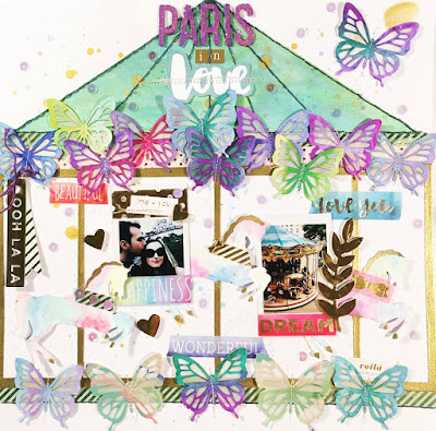
The inspiration- the painting reminded me of a carousel I photographed in Paris at Montmartre.
KAT

I was inspired by the pretty colours and the carousel theme to make a card featuring music notes, tickets and a tassel.
KRIPA


As soon as I saw the image, wanted to use flowers, watercolours and lots of butterflies.
JANE

I decided to go with something a little different in the form of a travel page and wanted to replicate the bronze background of the artwork by using a similar shade for my base cardstock. I've certainly embraced the butterflies in patterned paper, stamping and individual embellishments.
Our JANUARY inspiration is this fantastic painting by Ken Done called Sydney Night.

CRITERIA - A CITY theme
ELAINE

My son went on a digital media excursion to our state's capital city, Perth. His teacher took these photos of him and combined them to make one photo. I created a graffiti looking background with stamps, texture paint and a bit of watercolour. The night sky in the inspiration painting, drew me to using black as my main colour with a bit of colour added in.
TRACEY

I took the inspiration for the photo from the paintings subject matter and the background from the bright abstract style of the painting.
JUDY

I was inspired by the bright vibrant colours against the black background as well as the city of Sydney theme.
TANYA

The city buildings and the black and blue tones are what have inspired me to do my layout.
HELENE

A city theme with a difference ...
EVELYN

It´s a big dream of me to visit New York one day. May be in 2017? I was inspired by the dark background with the bold colors on top. I also tried to create a background in street art style. I hope you like it!
MARIA
My city is Saint-Petersburg in Russia. I like it very much! It inspires me. It provided beautiful scenes and backgrounds for many photos I've combined in an 8x8" album called "One city on a map. Saint Petersburg".


ANNA

Disneyland !! Like a whole city of dreams come true!! I have been inspired of the colors and the whimsical party feeling in the painting. This will be my reminder of always believe in my dreams and to believe in myself.
TONE

I have tried to make a city-scene ).. inspired by the buildings and colours.)
KAREN

The inspiration I have taken from this Ken Done picture is the colours and the stars.
KAT

I was inspired by the Sydney scene and the shapes and colours in the artwork. I made a cover page for an album about the years that I lived in Sydney. I created a photo collage in the shape of the Sydney skyline and added some wood veneer shapes of the iconic landmarks in the painting.
ANGELIKA
 This painting reminded me of chalkboard art and that is where I took my inspiration from- I used chalky pastel colours and chalkboard grey elements.

JANE

No comments:
Post a Comment